
Cost Component
Cost Transparency in Healthcare Part 2: Design
For the CVS Super App, we set out to combine various health services—such as triage, caregiving, medication management, rewards, and health spending—into a unified platform. Our focus was Health Spending, a new undefined epic.
Through the creation of personas and journey maps, along with collaborative workshops diving into colleagues' perspectives across business lines, my design lead identified four essential features for the Health Spendings epic: the Drug Cost Component, Checkout, Cart and Health Balances. I was assigned to design the Drug Cost Component to simplify cost transparency and strengthen user trust.
Role UX Designer
Timeframe 8 weeks
Platform iOS
Deliverables
Final Design
Developer Annotations
Tools: Figma
Notes This case study focuses on the design process for the cost component within the Health Spendings epic, built upon our extensive discovery work. With the heavy lifting done and a solid foundation in place, I was able to design quickly. I partnered closely with a PM, PO, BA, architect, and a team of 3–4 engineers throughout requirements definition and technical alignment. I also collaborated with our User Research Team (UXR) to ground the work in research.

MVP
The final MVP was a set of annotated wireframes, designed as a flexible solution tailored to multiple user scenarios.

Background
I was assigned to design the cost component, a feature defined through the collaborative discovery work I contributed to in the Health Spendings epic for the Super App.
The Problem
The biggest challenge with Health Spending, was the lack of clarity surrounding price transparency. People struggle with basic questions like "How much does it cost?" and "How do I pay for it?" due to the complexity of healthcare and insurance systems. Although we had a defined set feature, there was no clear direction on its design or concrete product requirements..
My Approach
Clarify Requirements
My first step was design & strategy meeting with the product team to clarify and define requirements which included:
Cost - brand and generics, savings such as pharmacy coupons or rewards
Cost for insured and out of pocket (unknown) insurance users
Plan information details - deductible, balances in HSA/FSA, payment options
Simplifying decision making process - presenting costs before adding to cart
Navigating an Undefined Ecosystem
Knowing the cost component would need to be reusable across multiple experiences, I proactively reached out to teams like the Prescription Details Page team to understand the current state of their workflows and identify logical integration points of the cost component - whether as a link, button, modal, or something else. Since ownership of the final pricing experience hadn’t been defined, it wasn’t clear who would be responsible for final integration. I focused on driving clarity where I could, keeping the momentum while staying flexible as things evolved.
Research & Competitive Analysis
Given the fast-paced timeline and the need to work efficiently, I drew upon CVS’s existing repository of research to quickly inform my design decisions. I reviewed with the user research team (UXR) relevant information, which included a Pharmacy Monitor Journal study of 21 organizations highlighted five key factors
1) Amount covered by insurance
2) Copay
3) Unit cost (daily/monthly)
4) Average retail price
5) User savings, in drug cost transparency.
These elements guided my approach to enhancing user clarity around drug costs.
I conducted a brief competitive analysis of indirect competitors which helped me identify best practices for cost transparency, confirming that most cost breakdowns appear only at checkout—a key factor I wanted to differentiate in my cost component.

Design Principles
Based on all of the requirements, research gathered and competitive analysis I landed on three guiding principles for my design
Health spending Guiding Principles
Make pricing feel predictable and trustworthy
Reveal cost factors that influence decision-making
Speak human, not healthcare
Designing with Moving Parts
Cross-Team Collaboration
Before sketching, I made a list of everything I needed to consider as this was a single reusable component that needed to be integrated into various other experiences like for example, a drawer or module on the prescription detail page. What was tricky was that those experiences were also in process so I needed to coordinate with the other teams without being prescriptive.
Technical Collaboration
Simultaneously, I worked with the architecture team to understand API capabilities. We uncovered challenges such as some coupons needed to be applied manually, which influenced how we defined the MVP’s scope. This iterative communication ensured that design aligned with technical constraints.
Given the complexity of the data and that I was designing for iOS first, I created three possible layouts for the component: a full-screen sheet, a tabbed layout, and a card-based design. Each option displayed the same information in a different way. After reviewing the options, the team and I determined that the full-screen sheet format was the most appropriate choice, aligning with native iOS best practices. It provided the most user-friendly experience presenting complicated data easily for users to engage with and digest without feeling overwhelmed.

First Iteration
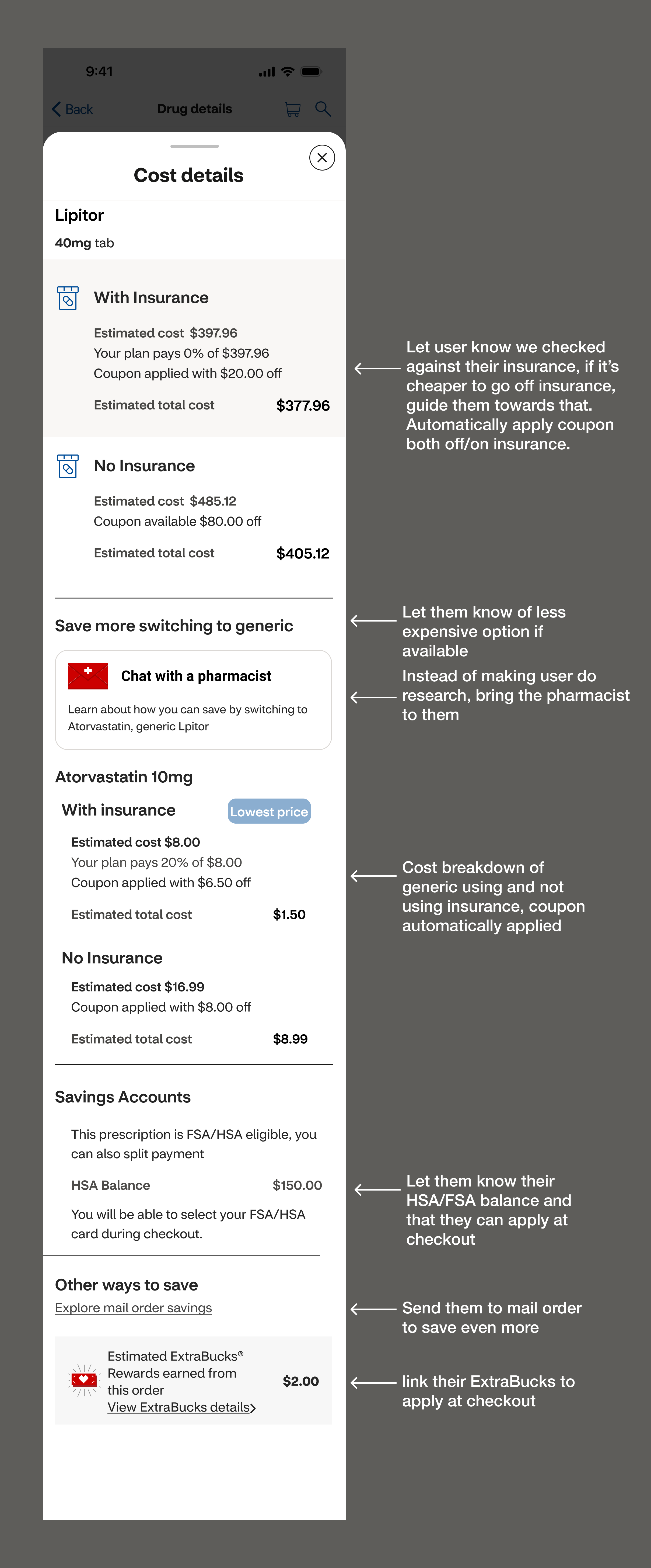
My first goal for this component was to display all essential drug pricing information clearly and concisely on a single sheet. This included showing both insured and uninsured prices, generic alternatives if a brand name was selected, HSA/FSA payment options, and available savings through coupons or mail order.
When it came to pricing, it wasn’t just about showing the price of the medication or what the user paid for last time, but giving the user the best price taking into account their insurance, applicable coupons, and possible HSA/FSA balances.
Initially the design was an action sheet for quick, easy access. However, as the number of details grew, the sheet became long requiring excessive scrolling, and raised accessibility concerns. Following iOS Human Interface Guidelines, I transitioned the sheet to a full-page detail view to provide adequate space and allow users to review all options without feeling rushed or constrained.
Revisiting UX: Adding Empathy
With the full page structure in place, the design was clear and straightforward, however, there was something very impersonal about a sterile page of data. I revisited my design principles:
Make pricing feel predictable and trustworthy
Reveal cost factors that influence decision-making
Speak human, not healthcare
The overarching theme between these principles was enhancing cost transparency AND building user trust. The page was transparent, but did it build trust?
I thought about moving “Chat with pharmacist” module to a more prominent space on the page at the top to help the user feel more connected, but encouraging calls, although personalizes the experience, would conflict with our business goal of reducing call volume.
Then the lightbulb moment: what if I brought the pharmacist to the user, directly on the page?
I introduced a welcoming pharmacist paired with a short friendly cost breakdown. This gave users context up front, so they didn’t need to hunt for explanations unless they weren’t happy with the options displayed. It informed them that alternatives might be available without overloading them with details up front, After a few iterations, I replaced the pictogram with a photo of a friendly pharmacist which further humanized the interaction. The shift transformed the component from a static list of information to an approachable trust worthy experience.
The result was a transparent, straightforward, and personal experience that reflected CVS’s commitment to fair pricing and giving users confidence they were getting the best price while building trust every step of the way.
MVP
The final MVP was a flexible solution tailored to multiple user scenarios: authenticated users with insurance and authenticated users without insurance. By leveraging a flexible design system, I was able to create a scalable, adaptable solution that addressed individual scenarios while maintaining consistency.
View full scenarios in dev handoff layer in detail with annotations here
Reflections
This case study demonstrates my ability to turn complex healthcare data into a clear, user-friendly, and scalable mobile first solution; leveraging research, cross-functional collaboration, and iterative design to increase cost transparency, build user trust, and simplify the often frustrating experience of understanding medication costs.
With more time, I would’ve explored better ways to explain deductibles, as it was a term that consistently caused confusion even within our internal teams.
While I couldn’t use AI during this project due to company policy, today I’d integrate AI throughout my workflow from brainstorming workshop structures and synthesizing affinity diagrams, to generating imagery for journey maps. I would also use AI to surface insights from existing research repositories by quickly pulling relevant findings or patterns that could be connected to analytics.
Ultimately, this project showed me the value of looking beyond the immediate problem to find new advantages like opportunities to transform functional clarity into emotional confidence.